Welcome to our MIDS W209 final project page
By Juanjo Carin, Kevin Allen, Matt Hayes, and Rosalind Lee
We created this page to demonstrate how New York City bike share data can be visualized using Tableau. We chose Tableau because of its readily available mapping tools and the ease of collaboratively working on our project despite working asynchronously. All of the workbooks on this page are hosted on Tableau public, which imposes a 10 million row limit on source data. The row limit meant we sometimes had to aggregate data over longer time periods than desired, but we think you'll agree that the results are interesting nonetheless!
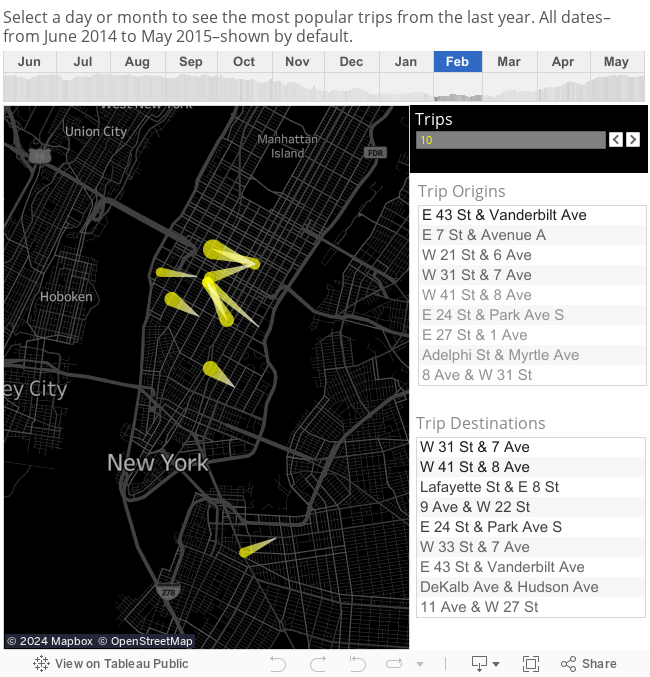
The first visualization allows you to see the most popular trips (i.e., checking a bike out and returning it later). You can change how many trips to show by adjusting the trips filter. Clicking a trip on the map will show you how its popularity changed over time. Plus you can see where bikes are coming from or going to by choosing a station in either the origins or destinations list. This dashboard should help understand when particular routes are more or less popular, thus anticipating seasonal demand or establishing a baseline for expected usage.
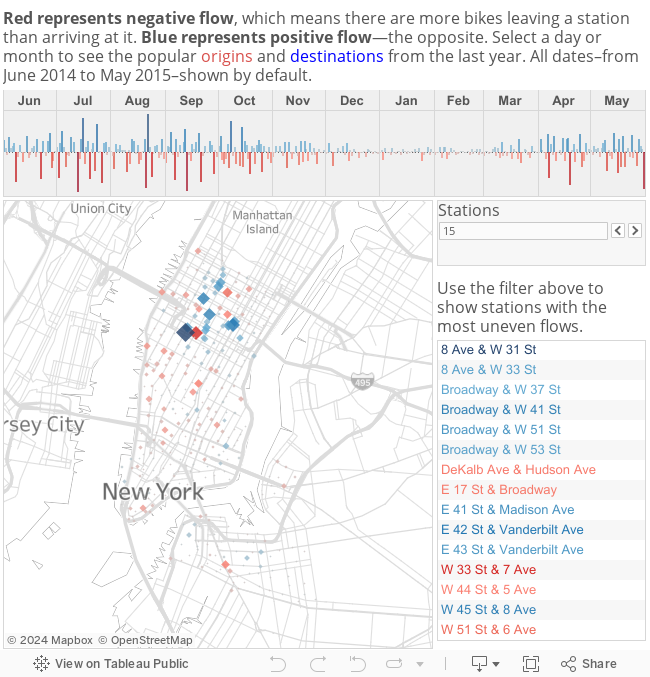
The second dashboard shows a comparison between where people typically begin trips and where they typically end trips. A larger diamond means there is a larger difference between the number of trips beginning at a station and the number of trips ending at that station. You can see how the flow of bikes to or from a station changes throughout the year. The list of stations on the right can be filtered to quickly identify the stations with the most uneven flow. This dashboard, when pointed at real-time data, would allow a Citi Bike employee to quickly discern where bikes are needed or should be moved.
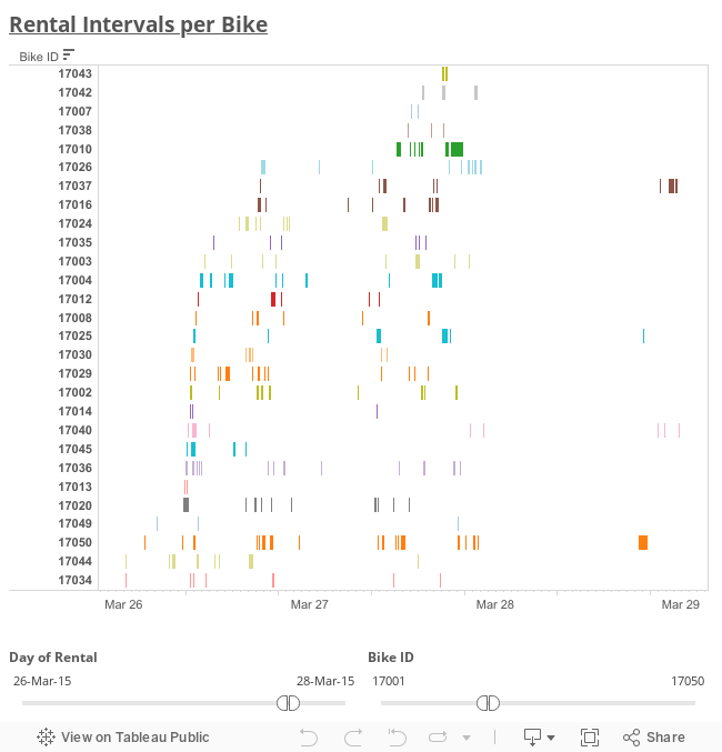
The following visualization shows the time intervals in which each bike was rented. Hence, the X-axis corresponds to time (from 1st of June, 2014, to 31st of May, 2015), and the Y-axis corresponds to bike IDs (from 14,529 to 21,907, though not all numbers in between are used: there are records from 6,617 bikes rather than 7,379). Each bike is plotted with a different color, but neither the ID number nor the color are important: this visualization is intended to find overall patterns.
You can filter by ranges of both time and bike IDs, either using the sliders or typing the desired start and end values. The bikes in the Y-axis are not sorted by their ID number, but by the moment they were rented for the first time, with those that were rented later at the top (so you will notice that most of the bikes were already available the 1st of June, 2014, and some hundreds were added over the following 12 months).
The length of each bar is proportional to the duration of a rental, and the white "gaps" between bars are also proportional to the time that particular bike was not rented. This produces the effect of white columns every night, when most of the bikes are not rented, and a wider one the 28th of March, 2015, when for some reason the service was interrupted in every station during almost the whole day.
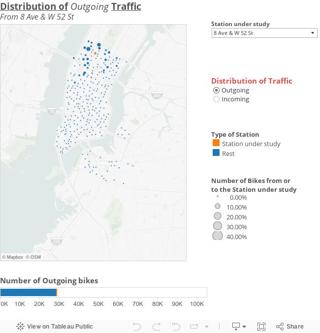
The map below shows, for the 12 months of analysis, the distribution of outgoing or incoming traffic. I.e., where the bikes that were rented in a particular station—"station under study," depicted in orange—went to (where they were returned ), or where they came from (where they were rented) when they were returned at that station. The size of the dots are proportional to the amount of bikes returned at or rented in the station in that position of the map; most of the bikes are rented for short trips so typically the biggest dots are around the station under study, not far from it. You will notice that the orange dot may have a certain size: this is because some users return their bike at the same station where they rented it. Consequently, that size does not change whether you select outgoing or incoming traffic.
You can select the station under study either by selecting it from the whole list, or by typing its name—or even its first characters. The bar below the map shows the whole number of bikes rented in or returned at the station under study, distinguishing between those that were returned at the same station (orange) or another (blue) for "outgoing" traffic, or those that were rented at the same station or another for "incoming" traffic. Hence, the total length of the bar is proportional to the sum of the areas of all dots.
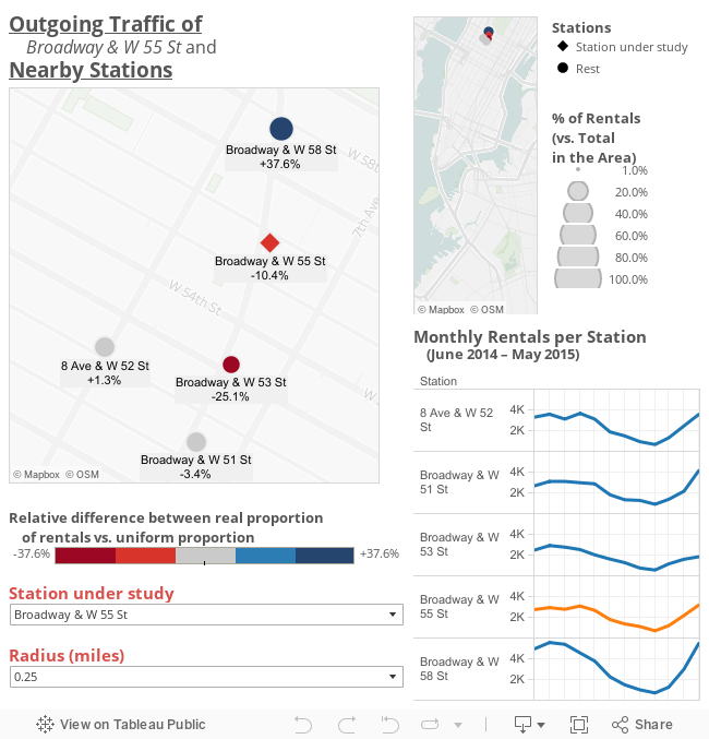
In the following visualization you can select a station and a radius (in miles), and the map will show all the stations around the selected one, within the chosen radius (from 0.15 to 0.30 miles, in steps of 0.05 miles). Of course, the number of stations that are plotted depends on the radius you have selected. Each station is represented with a dot (a rhombus if it's the station of interest, and a circle for all its neighbors) whose size is proportional to the number of bikes that were rented in each station during the 12 months under study. The location of those stations is also shown in the small map to the right, to give a better idea of where they're located in New York City. The graphs on the lower right corner show how the total number of rentals in each station is distributed along the 12 months of study: you can see the exact values if you hover mouse over the lines of each graph.
Besides, if you hover the mouse over a station in the amp, you will see its name, the name of the station under study, the distance between them, and three percentages. The first one is the proportion of bikes rented in that station, compared to the total number of bikes rented in the depicted area (so all the stations shown sum up 100%); this percentage is also proportional to the size of the dot. The second percentage is the hypothetical rate if the amount of bikes rented had been equal in each station. Hence, it will be 25% if 4 stations are shown, 33.33% if 3 stations are shown, and so on. Finally, the third percentage, which is also shown in the map below the name of the stations, is the relative difference between the previous ones. The color of the dots depend on that percentage, varying from red (for negative differences) to gray (for differences close to zero) to blue (for positive differences). This allows us to determine if a station was more or less used than its neighbors. E.g., if four stations are shown in the map, the second percentage will be 25% for all of them: if the first percentages are 50%, 25%, 12.5%, and 12.5%, the third percentages will be 100%, 0%, -50%, and -50%, respectively, meaning that the number of bikes rented in each station was twice, equal, or half the number of bikes rented had the traffic been uniformly generated.
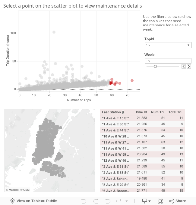
The visualization allows you to see the top bikes that need maintenance by week. You can select the week using the slider. To increase or decrease the number of bikes that need maintenance, select the chosen value from the TopN dropdown. The bikes that need maintenance are shown in red on the scatterplot. When a given plot is clicked the last station the bike was at is shown on the map labeled with the station name. The last station, total trip time, and number of trips for each bike per week is displayed in the table.
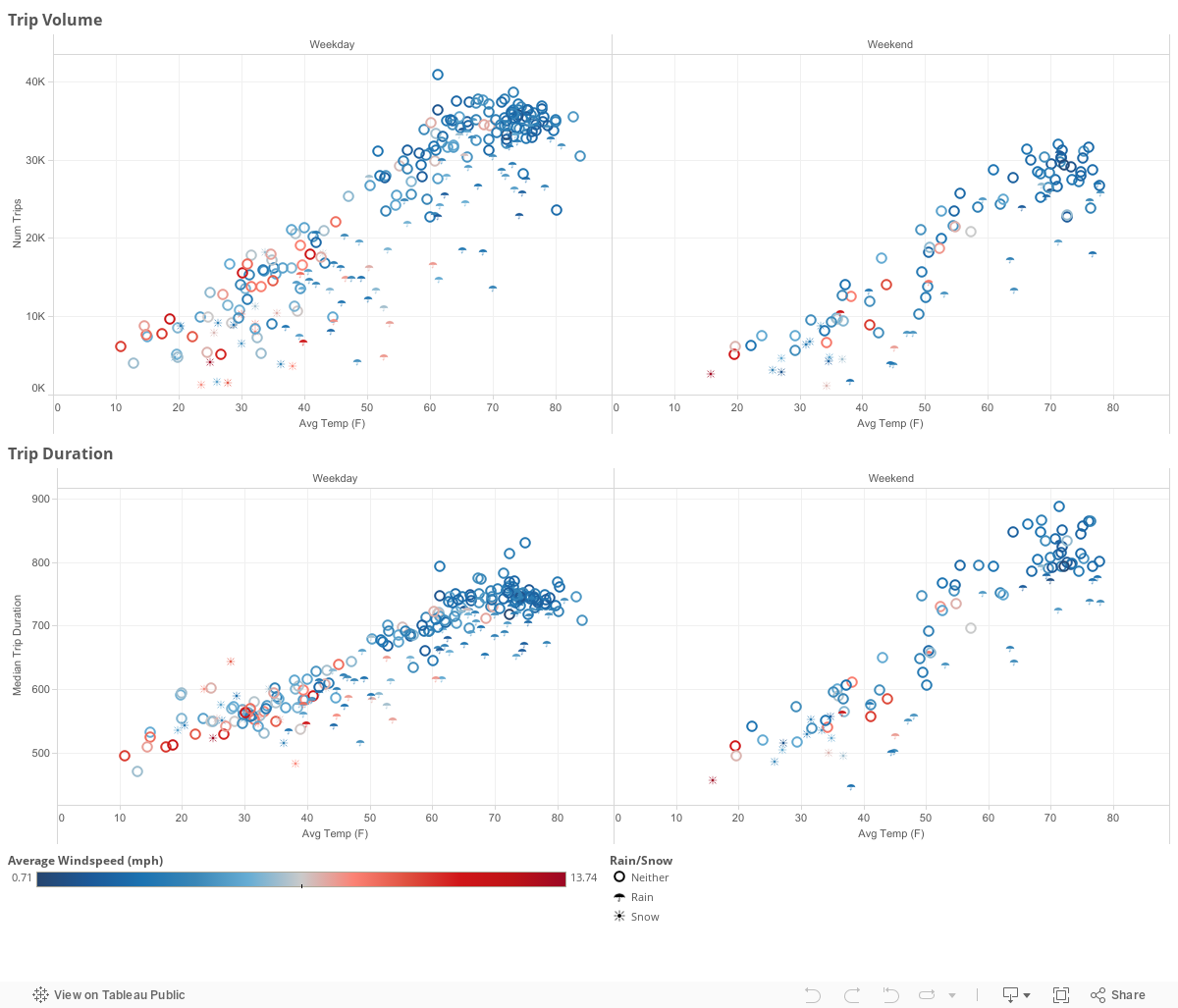
In this final visualization, you can examine the relationship between the weather and Citibike rider behavior. The x-axis displays the temperature in degrees Farenheit. The colors represent windspeed with red indicating high winds and blue indicating calmer wind conditions. Rainy days are represented by an umbrella and snowy days are represented by a snowflake. The charts on the left represent weekdays (Monday-Friday) whereas the charts on the right represent weekends. We chose to make this distinction because weekday riders are more likely to be commuters and weekend riders are more likely to exhibit recreational behavior. Weather data is sourced from the QCLCD dataset published by the National Oceanic and Atmospheric Administration (NOAA).